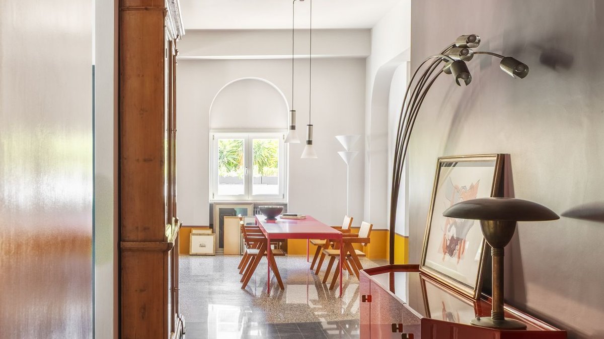
Casa Alkymia, a apartment of 230 square metres in Rome’s Monteverde Vecchio district, showcases the work of studio Punto Zero, which treats colour as an architectural element rather than mere decoration.
Design rooted in rationalist history
The renovation sits within a 1930s palazzetto, a building whose original rationalist features guided the redesign. Architects Arianna Nobile and Giorgio Marchese, founders of the studio, said they “reinterpreted the arches of the exterior façade and the rationalist curved forms as recognisable elements within our project.” The façade’s arches and soft curves were echoed inside, creating visual continuity between old and new.
Rather than impose an open‑plan layout, the team reshaped the floor plan around the young owner and his family. A large structural opening was cut between the kitchen and living area, loosening circulation and drawing light deeper into the interior. “And to bring the terrace space ‘inside the home’,” Nobile added, emphasizing the desire to blur indoor‑outdoor boundaries.
A sculpted plasterboard wall—filled with arches, recesses, and curves—organises the windowed walls and the new opening into a single composition. Marchese explained that this solution “allowed us to visually recede the pre‑existing windows, so that their varying proportions could coherently fit within a harmonious composition inspired by the language of early twentieth‑century architecture.”
Colour as spatial language
Colour consultant Blu di Prussia assigned each room a distinct emotional register. The kitchen is cloaked in powder pink on both walls and ceiling, creating a soft, enveloping atmosphere. In the master suite, a saturated carmine paired with black terrazzo defines a bold, intimate space. “In this way, we created a sort of red box within a pale green box,” Marchese said, borrowing hierarchy from historic suites.
The children’s bedroom features blue‑toned ceilings that lower the room’s lofty proportions, making the space feel cozier. Throughout the apartment, terrazzo serves as a connective material; entryway flooring uses fine anthracite grain, while the living room showcases a coarser, more colourful aggregate. Brass inlays trace transitions, running straight through doorways and swooping into curves along corridors.
Related: Shoppers abroad find local home gems
Furniture selections further reinforce the dialogue between old architecture and bright hue. Pieces include a Cassina Bramante sideboard, a Warren Platner armchair for Knoll, a Gino Sarfatti pendant lamp, and a Renato Guttuso lithograph. The mix of design heavyweights highlights the studio’s intent to let historic structure and contemporary colour meet halfway.
It feels strange walking from a muted entry into a living room that bursts with colour, yet the flow feels natural.
Future projects in the area may adopt a similar approach—using colour to delineate zones while respecting original structural cues—shifting interiors toward more expressive yet context‑aware designs. The success of Casa Alkymia suggests that such a strategy can be both aesthetically striking and functionally coherent.
Photography by Eller Studio captures the apartment’s layered details.
Styling by Alessandra Orzali and the colour work of Blu di Prussia complete the visual narrative, presenting a cohesive example of how colour can serve as an architectural language in a historic setting.



Leave a Reply